The Product
Gordian Cloud is an enterprise job order management platform that allows facility owners and their contractors to manage Job Order workflow collaboratively online.
The Brief
Devise a user experience strategy and framework for creating a unified, consistent experience across Gordian's core products.
Throughout the process, I collaborated with the Chief Technology Officer, Systems Architect, Marketing Team, Customer Service Team, Product Owners and Developers.
Deliverables
- Stakeholder interviews
- Product audit
- User research
- Shared conceptual model
- Low-fidelity flow maps
- Wireframes
- Visual design
- Coded prototypes
- Experience design playbook
- User Experience Framework
The Problem
The current system was slow, complex, clumsy and led users to mistakes instead of helping to avoid them.
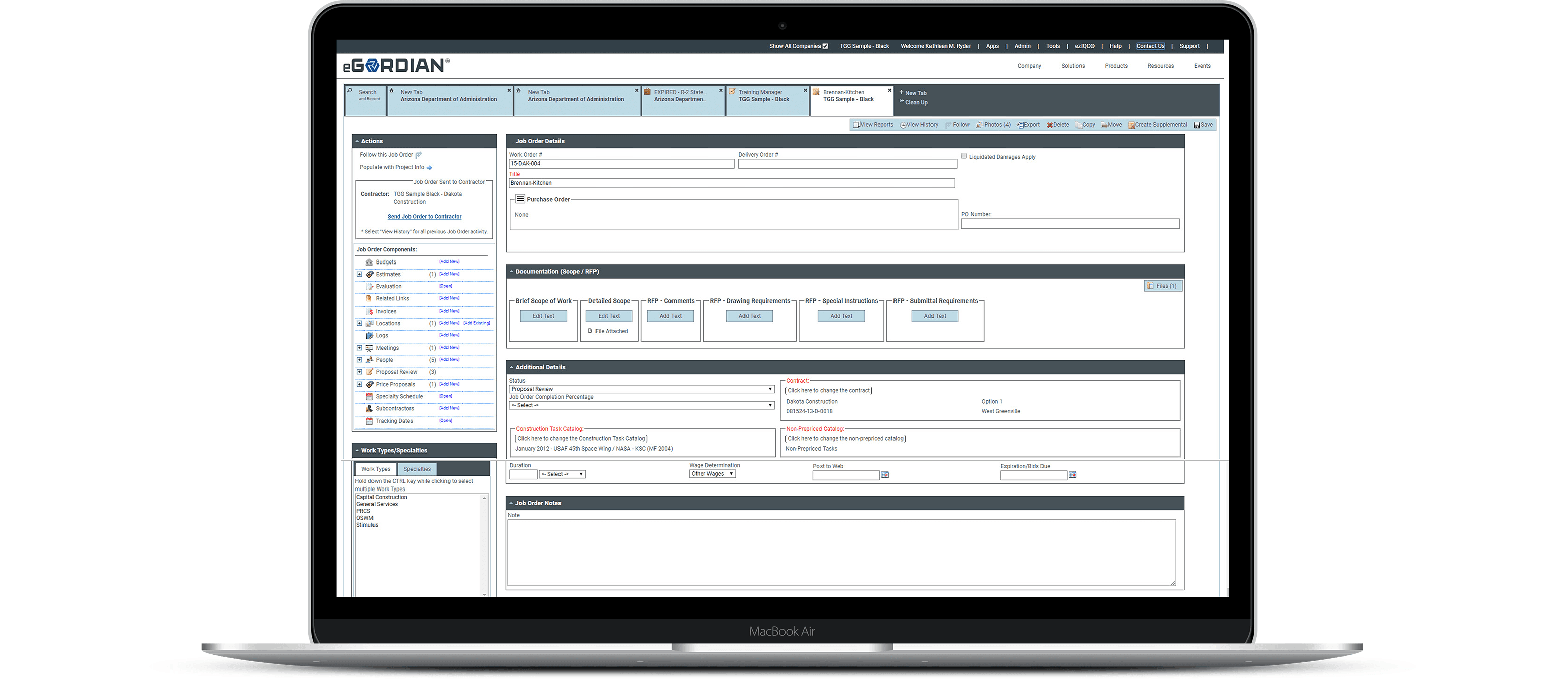
Inconsistent visual elements
Several different sizes and colors for buttons, forms elements, etc.
Complex
Long learning period and extensive training required for new employees
Front-end technical debt
Increased maintainence as a result of inconsistent layouts
Lack of design patterns
Forced users to complete the same type of task in different ways
Overfeaturized
Took a lot of time to find important functions
Research & Discovery
Interviews
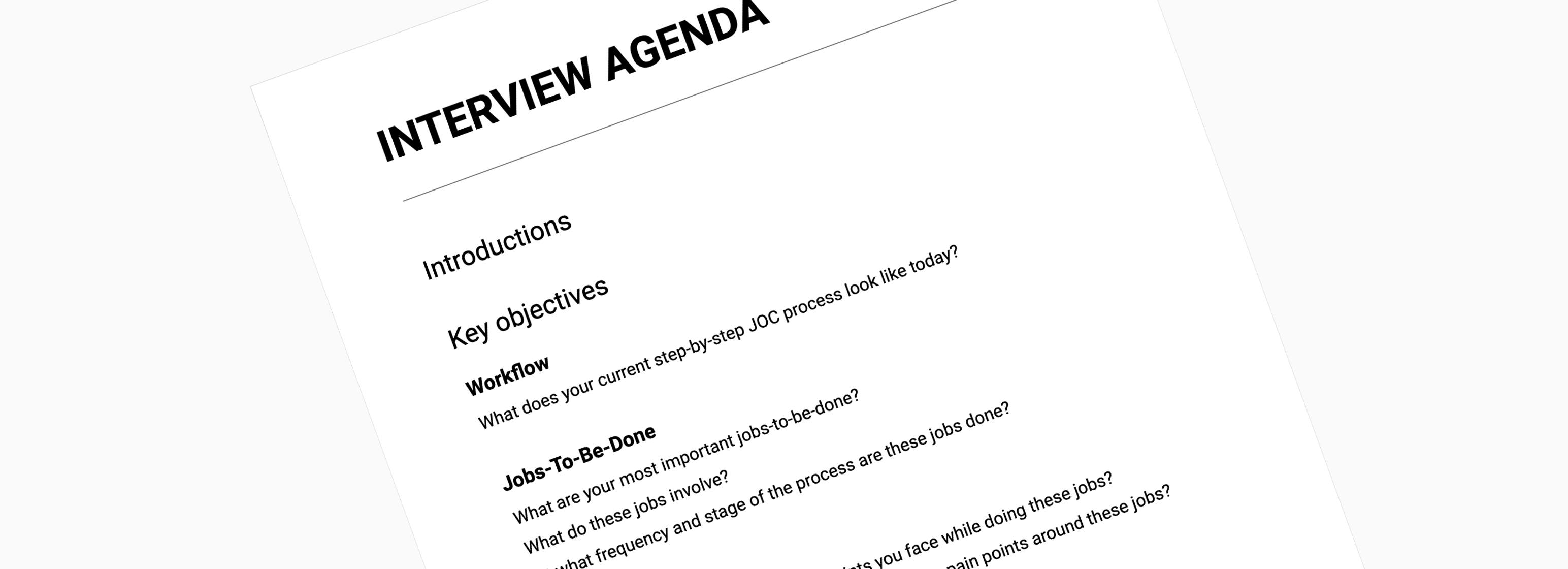
My first step of any project is to develop empathy with the users. I conducted interviews and Contextual Inquiry sessions with users and internal stakeholders. It was also important to get the domain knowledge and understand terms like Procurement, Cost Data, Scope Development etc.
Working closely with the Gordian Cloud team throughout this project helped give insight into the customers and their perspectives while using the platform. The research I gathered provided knowledge that drove the interface updates, enabled me to consider their context while building interactions, and highlighted the problems they had that the product was designed to solve.
UI Audit
Since I was redesigning an existing application, I performed a UI Audit.
The UI Audit focused on 4 main areas:
- User Flow/Task Analysis
- Action/Transition Analysis
- UI Inventory
Key Activities
I facilitated the following activities throughout the research and discovery stage:
- Kickoff workshop
- Stakeholder interviews
- User interviews
- Site visit
- Journey lines
Analysis & Synthesis
Once research was completed, I did an immediate debrief with leadership to report highlights of the research findings. The next steps were to dive deep into the findings to better understand and organize the complexities and problems discovered.
Persona Building
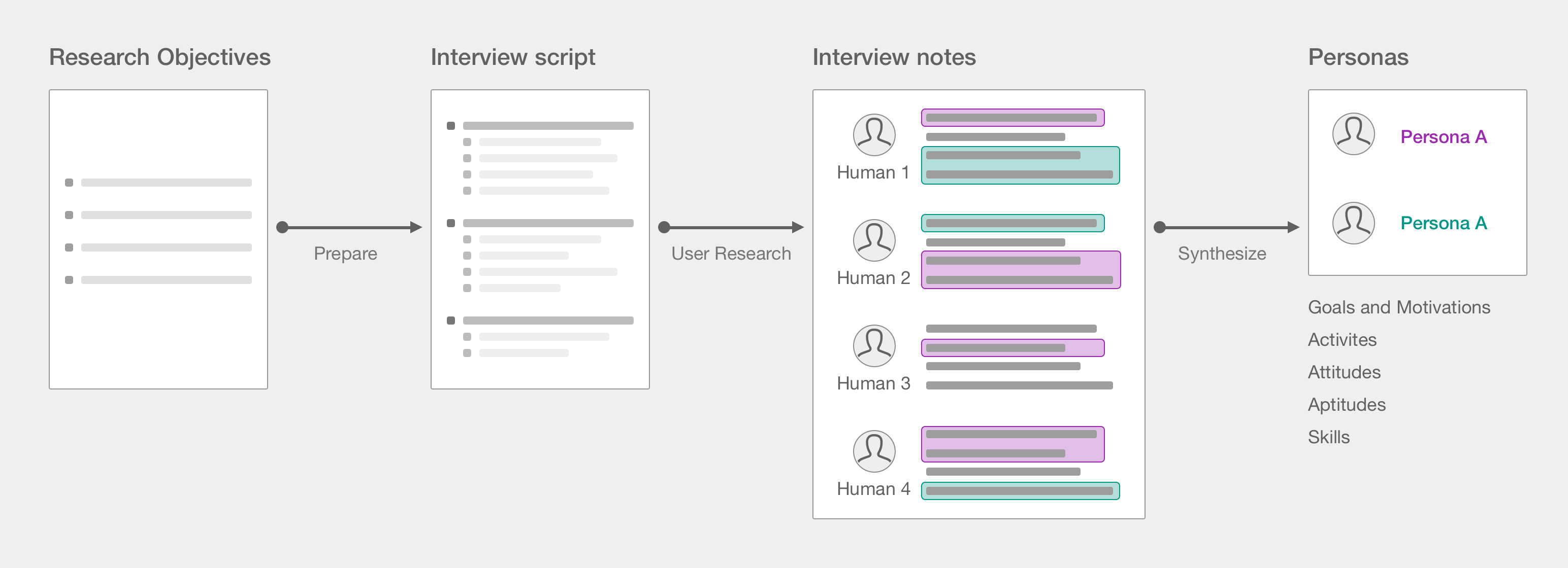
User personas were the foundation for a solution that would be not only aesthetically pleasing but, most importantly, highly practical and usable. Here, it was crucial for me to get in touch with the people who were using the solution every day. I built personas by conducting in-person interviews with internal stakeholders and end-users.
I made the company aware of users’ needs, emotions and pains. It was also important to communicate the everyday routines and duties of different user types.
The users felt that the current solution was overloaded and complex. Even after many years of working with it, a user still didn’t understand all the functionality. Unfortunately, instead of helping, the current software created friction.
Based on my research findings, it was enough to create three primary personas:
- facility owner
- contractor
- account manager
The creation of these three personas allowed us to get a detailed look at the users Jobs-To-Be-Done (JTBD) by putting digital interactions into real-person experience and context.
We discovered a lot of struggle and negative emotions caused by the existing solution. This allowed me to create empathy maps, collecting what users think and feel about executing their duties. Empathy maps provide valuable context for the Jobs-To-Be-Done.
Key Activities
I utilized the following activities throughout the analysis and synthesis stage:
- Card sorting
- Persona development
- Empathy maps
- JTBD (Jobs-To-Be-Done)
- "How Might We" questions
Engineering: The Backbone
This stage allowed me to implement all of the ideas created through research and synthesis. At this important juncture, I turned my vision of an ideal user experience into the architecture and operation of the new platform.
Information Architecture
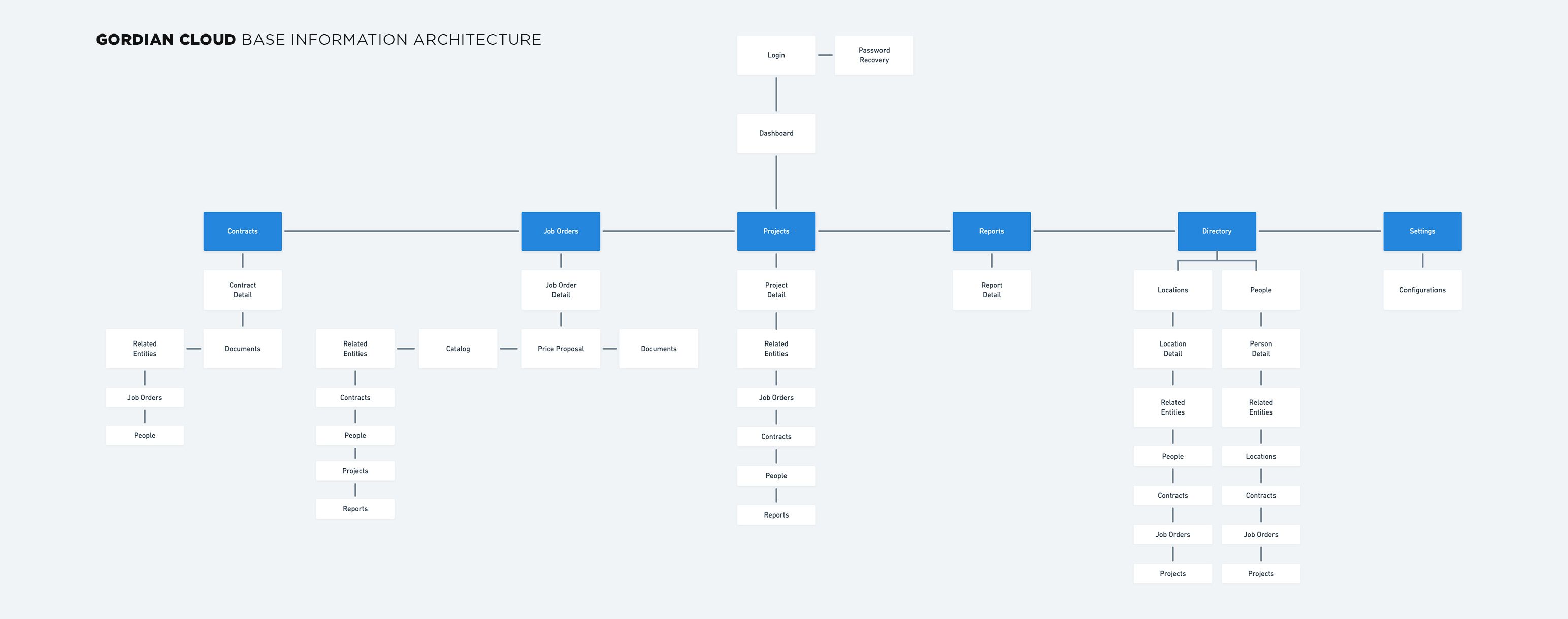
I tried to make the new JOC solution as simple and easy to understand as possible. I created one overall architecture for the entire solution and three smaller ones for each of the user personas. This allowed everyone to understand the differences of information we should include to keep the product intuitive and holistic.
User Flows
I tried to make the new JOC solution as simple and easy to understand as possible. I created one overall architecture for the entire solution and three smaller ones for each of the user personas. This allowed everyone to understand the differences of information we should include to keep the product intuitive and holistic.
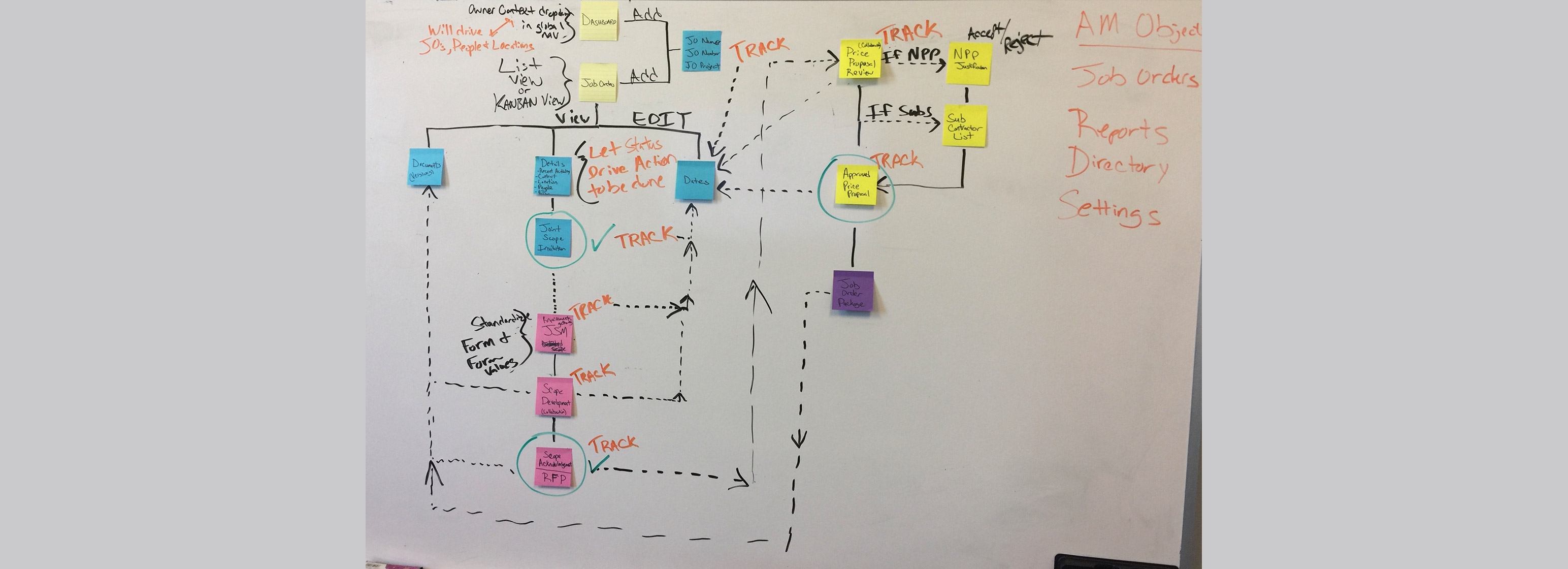
I facilitated the following activities throughout the engineering stage:
- Object-oriented UX (OOUX)
- Call-to-action Inventory
- User Flow/Task Analysis
Ideation & Early User Testing
FAIL FAST. I learned that facility owners need a solution that gave them visibility into exactly where the job orders were in the JOC process, which documents were required and what actions to take. My first assumption was that facility owners would want to see this in a single view with each stage represented in a collapsible section — but after testing, I realized that this type of view was not conducive to properly informing facility owners, and quite frankly, produced too much cognitive load.
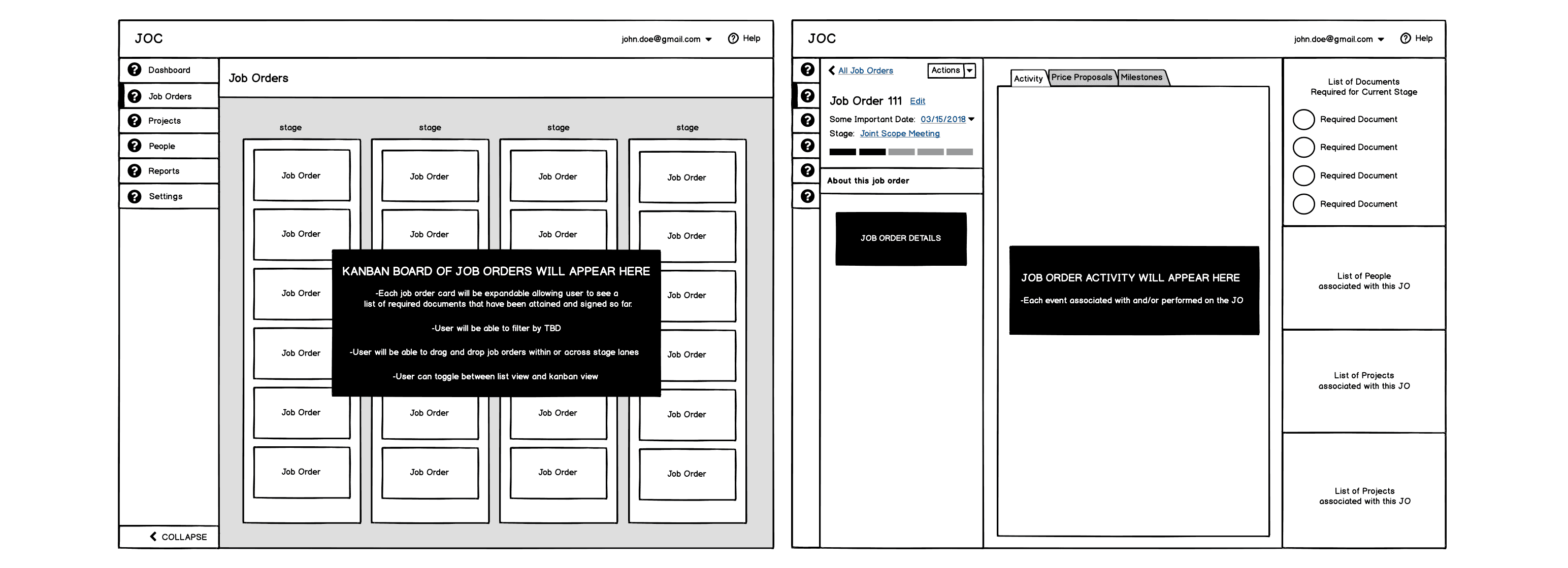
I began exploring solutions that provided a snapshot view of the current state of the job order. This would allow facility owners and account managers to be informed of what is most important to them and take the necessary pending actions.
Layout
The first high-level issue I noted was an inconsistent layout for different parts of the app (one for Contractors, and one for Facility Owners). This was identified as a maintainability issue that was a known area of technical debt for Gordian Cloud's tech team.
Having one layout with consistent patterns and identifiable architectural areas would give all users a consistent experience as well as enable the team to continue to create new, stable features for their customers.
The design concepts began with simple, low-fidelity wireframes. This format allowed me to generate multiple ideas and communicate their intent with Gordian Cloud's team without investing too much time or energy into options.
In order to create a familiar layout, the decision was made to align both areas of the divergent design into one traditional dashboard-style layout. This included a sticky sidebar and a scrollable content area.
Color palette
Identifying the key brand colors and the theme for the application enabled the creation of a palette of accessibility-tested and reusable colors.
Colors derived from the brand were selectively used for focused call-to-action behaviors and interactive states. While the palette of colors chosen purely for the app elements reflected a sense of consistency and predictability based on the hierarchy of the element in the interface.
Contextual Navigation
I used the insights learned from the previous OOUX activity to define contextual navigation for each primary object. This allowed users to easily navigate to any and all related entities from within an object's detail view.
Usability Highlight: Forms
Forms are one area of an application that can be easy to overlook during an evaluation of the efficacy of the interface. In Gordian Cloud’s case, the forms suffered the common pitfall of inconsistency and disorganization.
- Poor visibility with information grouping
- Inconsistent error validation
- Improper elements
To address the visual disorganization of forms with categorized sections, I designed a new single column layout for all forms. Within this layout, I logically grouped form fields using fieldsets. These updates created a more readable, efficient experience while filling out extensive forms.
For validation, and overall form group structure, I reorganized the layout to display the field label, help text, error message and input, in that order.
I also created a decision matrix to ensure that designers and developers used the correct form elements in given situations.
Usability Highlight: Search
One could argue that the ability to search the JOC catalog for materials was the single most important feature of the platform. As it stood, the search user experience was sorely neglected, and as a result, a common pain point amongst users.
Upon auditing the current search UI, I suggested a complete UI, usability and search algorithm overhaul. I'll cover this breakdown in a subsequent case study.
Prototyping and Testing
This is my favorite stage. It's where the vision really begins to manifest itself and users provide invaluable feedback.
Real Prototypes
I chose to code a real, functional prototype using HTML, CSS and Javascript. This allowed users and stakeholders to easily test and validate complete flows on various devices.
In addition, a real prototype eliminates throw-away artifacts. Developers can easily integrate their services and port working code directly from the prototype.
User Testing
User testing was done early and often. It was moderated on-site and involved creating carefully thought-out scripts of various tasks.
After each user test, I would debrief with the Gordian Cloud team and iterate on the prototype based on test results. This process could involve many rounds.N
The Solution
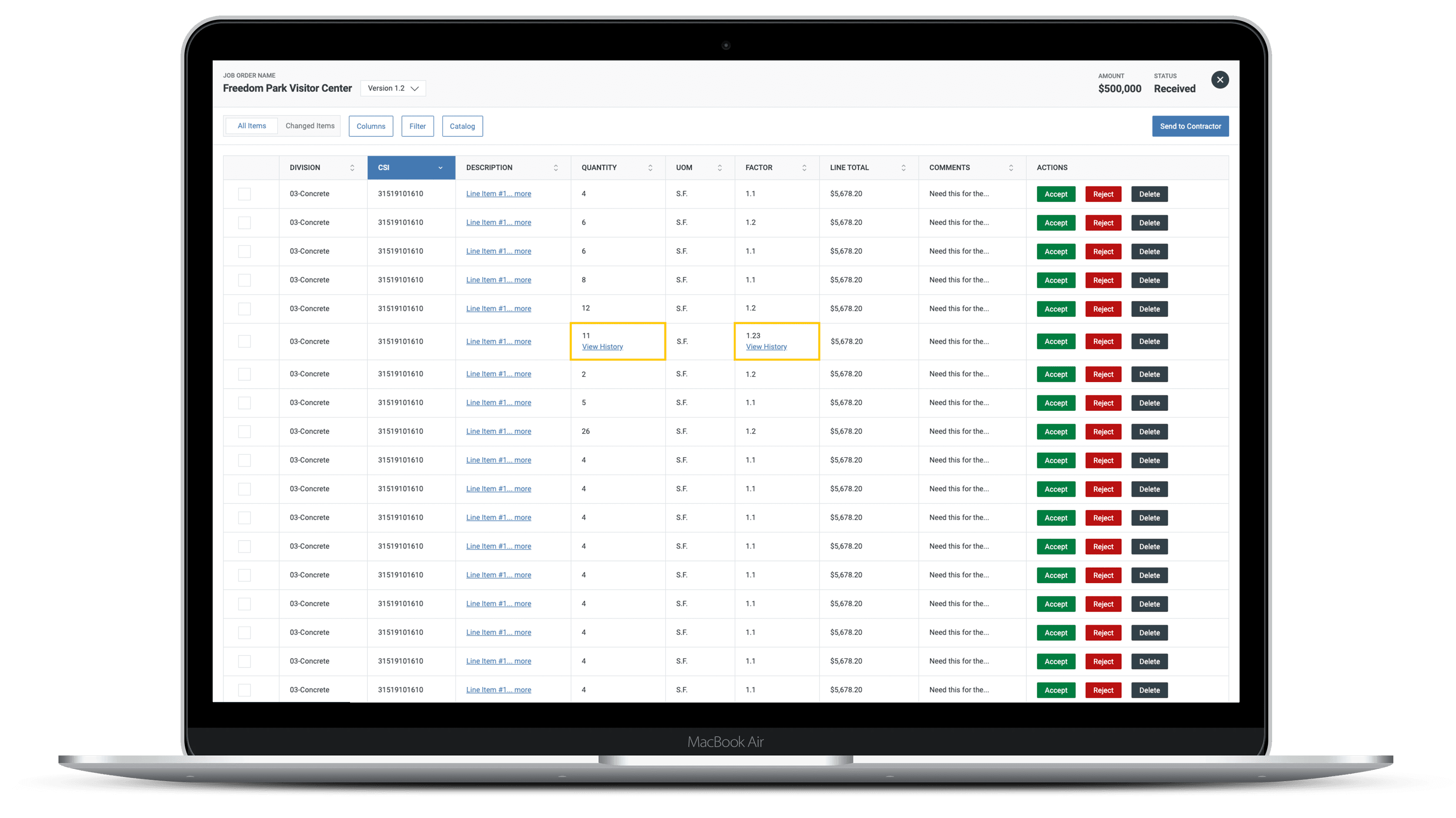
Negotiate Price Proposals, Collaboratively
The crux of the application is around building, reviewing and approving price proposals. I worked with users to design a collaboration feature that allowed them to accept/reject proposed items, add notes to a decision, as well as see if anyone else was editing the proposal at the same time...a la Google Docs.
The Solution
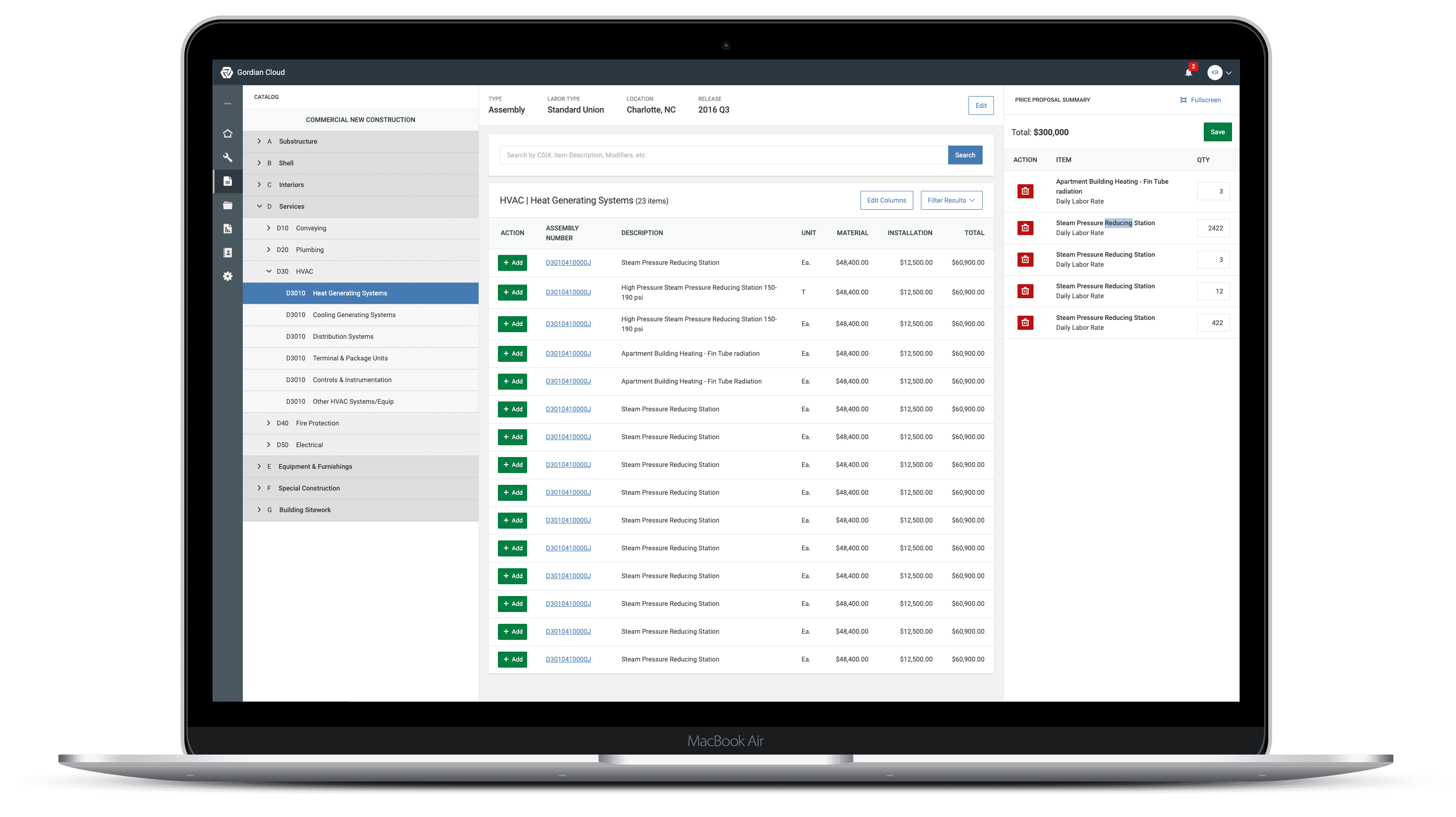
Create Price Proposals, Faster
A main concern that I heard from users in my research was that it was cumbersome to build out a price proposal. The process involved searching the catalog of materials and then adding those items to the proposal. Users complained about not being able to view the proposal while searching the catalog. I worked with users to design a multi-panel, shopping cart pattern. This allowed users to see the catalog navigation, search results and a condensed view of the proposal in a single view.
The Solution
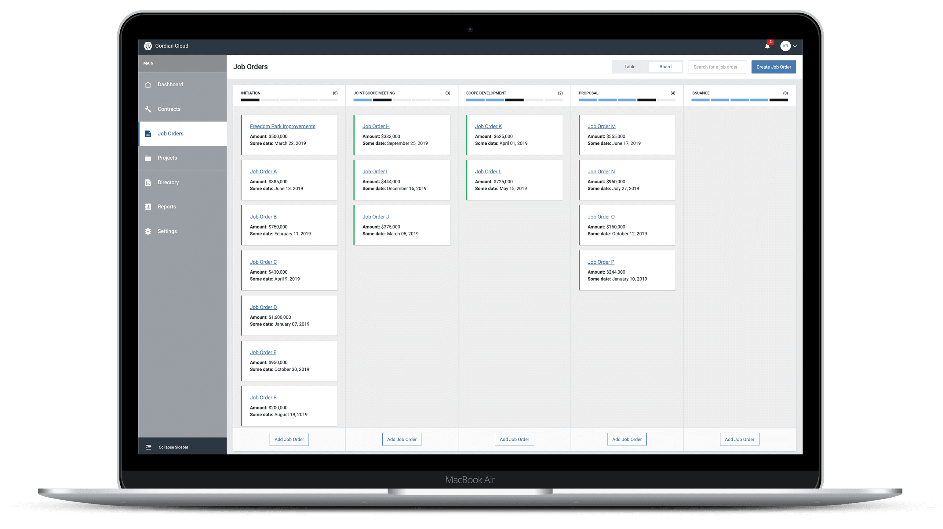
"Where are my job orders?"
Account Managers needed a birds eye view of the state of all their job orders.
The Solution
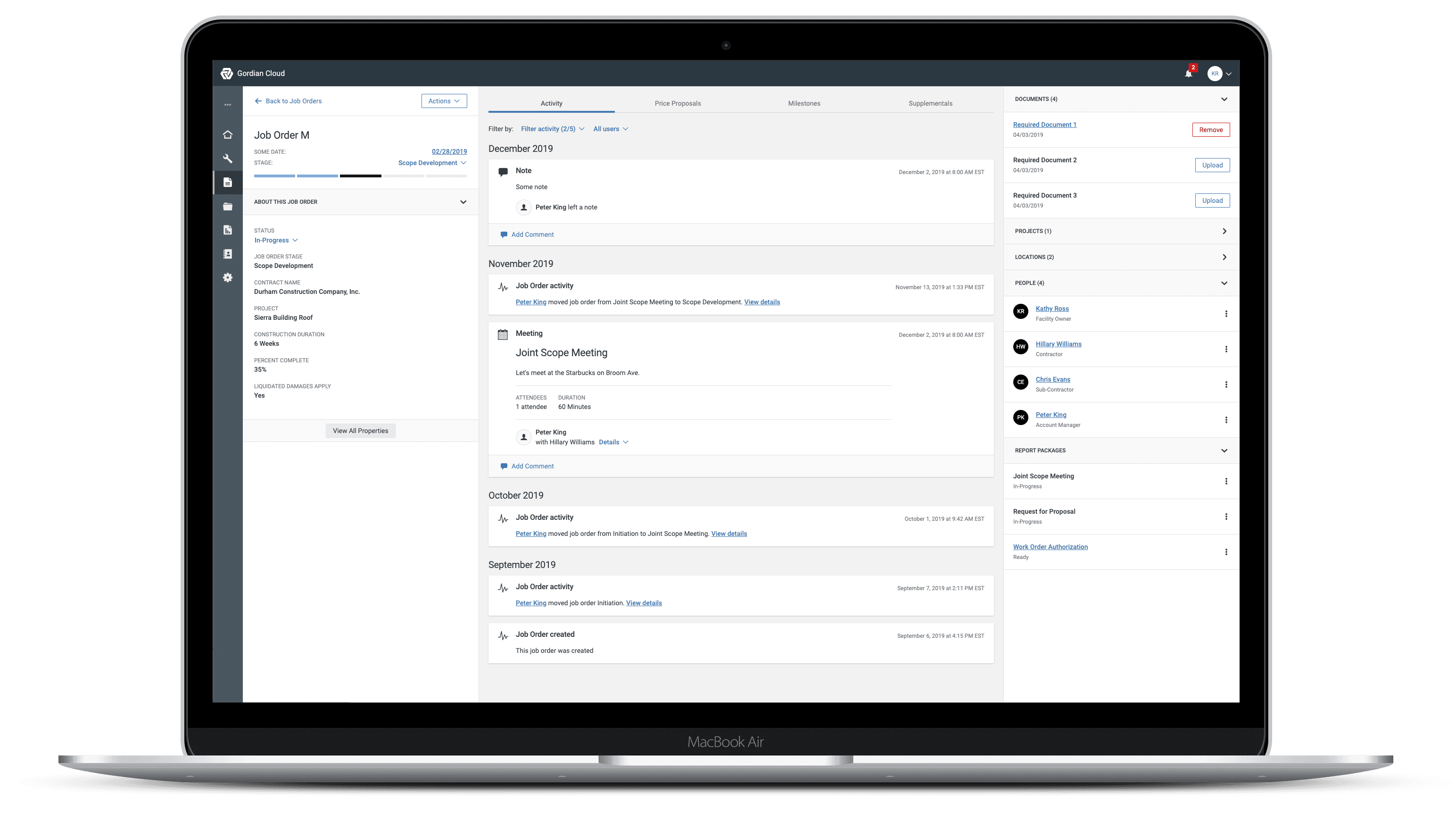
"What's the status of my job order?"
Facility owners needed to know exactly where their job orders are within the JOC Workflow to prevent missing important contract dates and stay within budget.
A By-Product
As I mentioned earlier, the current system had no common visual language or underlying front-end code to connect its library of web apps. Instead, every web project started at square one, with developers piecing together design solutions in isolation. Time after time, they rolled out reinvented wheels.
The result of this ad hoc process: developer productivity was slower than it might have been, quality was uneven, the user experience changed from app to app, and most visual designs didn’t reflect the company’s brand.
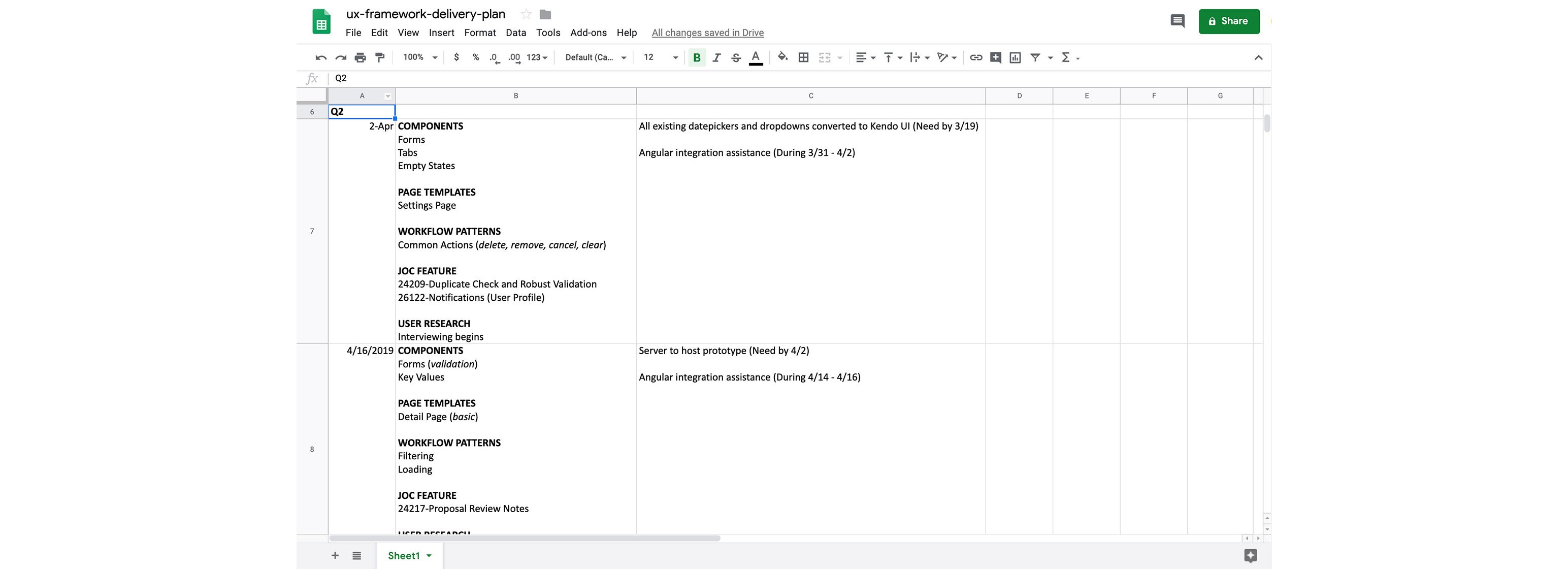
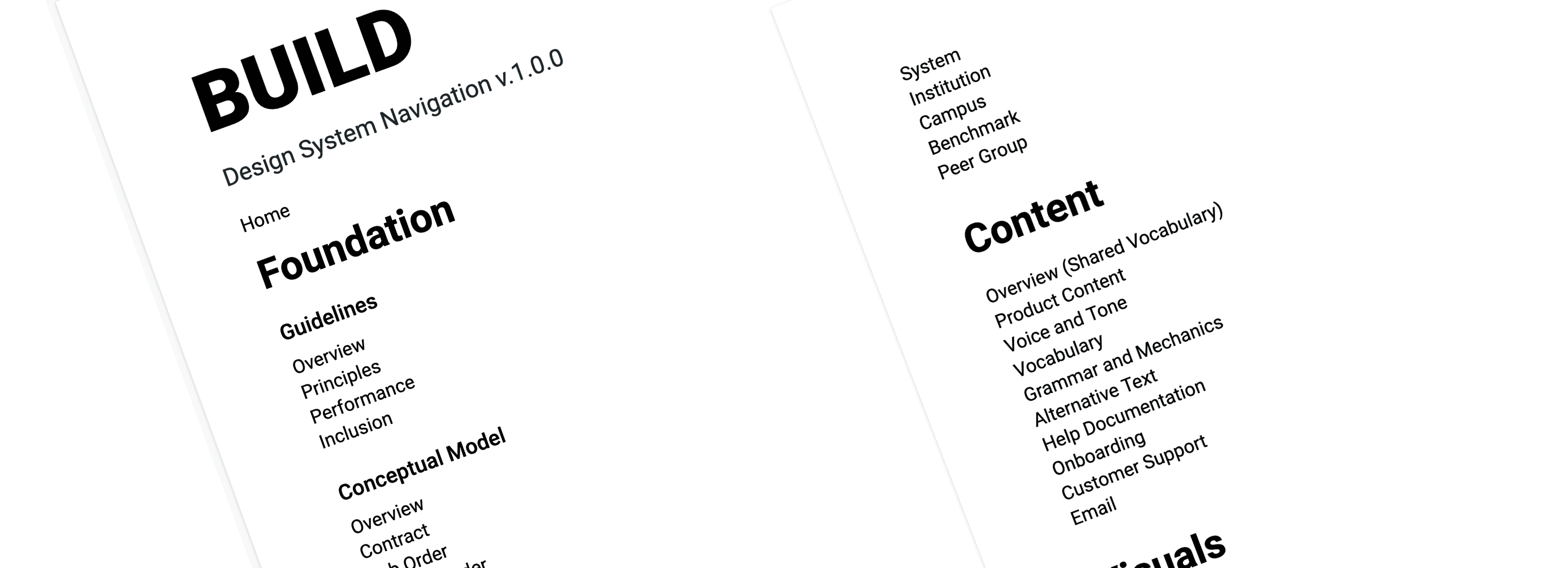
I built a cohesive, full-stack user experience framework named BUILD to help fix those problems. BUILD embraced a fully expressed design language, detailed UX guidelines, and revamped tools to fit the Gordian Cloud's workflows.
My strategy for promoting understanding and adoption of the framework was easy to use would naturally fit the developers' workflow (Angular). This strategy involved equipping developers with "Angular-ready" cust-and-paste code snippets for each component, in addition to static HTML.
Visual Language
I adapted Gordian's existing brand guidelines to fit the needs of modern web apps. I had to account for every interactive element and component state, such as hovered, focused, active and selected — and make sure they were consistent.
CSS Framework
Underneath the hood, I developed a CSS architecture using ITCSS and BEM that would be friendly to maintain and stand up to large-scale collaboration. The class naming is easy to understand and obvious to extend; it’s effectively self documenting. All of this makes the system fast to learn, inviting contribution and extension by developers.
Accessible, Battle-tested Components
Each component that BUILD showcased went through a rigorous process to make it to the big leagues!
The process included:
- Research (is this new component or a variation of an existing one?)
- Documentation (when and how to use)
- Accessibility testing (WCAG AA)
- Browser testing (Chrome, Internet Explorer and Safari)
Shared Conceptual Model
The OOUX activity I did during the engineering stage helped inform the shared conceptual model for Gordian Cloud. It describes the product's primary objects and how they interact.
The Gordian Cloud conceptual model provided insight on the following objects:
- Contract
- Job Order
- Supplemental
- Estimate
- Price Proposal
- Contractor
- Facility Owner
- Account Manager
- Location
- Sub-Contractor
Shared Language
A shared language helps designers, developers, support and help doc authors all use the same word to describe the same thing, so organizational fogginess goes away. It's important that everyone uses the same language from code to customer.
Ready to Use Templates
I created several starter templates for common scenarios and Gordian Cloud workflows. Developers can get these up and running to test the system and start building their own apps fast.
- Basic Page Template
- Object List Template
- Object Detail Template
- Multiple Sidebar Template
- Simple Form Template
Product Themes
I optimized the CSS styles for flexibility so that developers could extend BUILD for specific departments or sub-brands.
Next Steps
Automate and Inform
Introduce more opportunities for data scientists to learn about user search tendencies and JOC workflow stage actions.
Integrate
In order to better serve customers, I think a service marketplace is needed to integrate with some of their existing systems. From there, we could import information about important dates and improve third-party communication.